
The scary fact they quote is that 88% of all spreadsheets are wrong! The consequences of relying on bad information as a result can be insane! That reminded me of a couple of lessons from years ago in terms of good spreadsheet design.
1. Check calculations
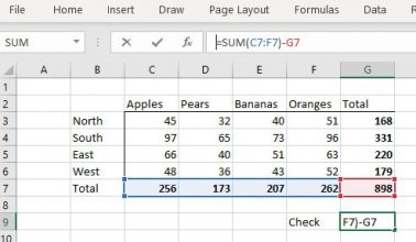
It’s so easy, especially when adding/inserting new rows, to inadvertently sometimes miss out a ‘sum’ formula.
Always try to create cross-check calculations that make sure your formulas add up. In this simple example, it’s pretty obvious:

As your tables become more complex, maybe with blocks and sub-blocks, for example a P&L, then it becomes easier to make an error and more important than ever to add checks.
In this case, it’s simply checking the verticals and horizontals match – one minus the other should be zero.
Excel will often try to warn you of errors with a small hazard symbol, but I have found that it’s not reliable.

2. Highlight inputs and outputs on your “what-if” models
To make it easy for other people to use your complex models, it pays to highlight the fields that operators should complete, and even to group them together, as well as making the results clear.
3. Avoid inserting rows to make attractive spaces as a design feature
Excel thinks the data is in separate lists and will treat blank rows differently depending on the functions you need to use. For example, autofill will stop at a blank row as will formulas, so you could find your worksheet doesn’t update as you expect.

Avoid inserting blank rows or columns in a worksheet, instead use formatting to emphasise key data which will help to make the worksheet easy to read and absorb.

4. Don’t use Excel when you should be using other software
Excel is an amazing tool and can be bent to your will. That means many people try using it for things that go beyond what it was designed for , e.g. project plan and task management (doesn’t have enough capability for anything beyond basic task management).
The main misuse is as a database. Excel is not a relational database, but is often used as one. Worksheets become unwieldy when used for complex project plans or to manage tasks, or to store raw data. This kind of use is fine for manageable sized lists, but if your users have to scroll or split the worksheet, then it’s likely using Excel as a database is the wrong software and you should consider Access or SQL instead.
5. Printing the whole spreadsheet

It’s a pretty common occurrence that a user presses ‘Print’ and only then realises that the entire worksheet is printing, including any blank rows and columns. Instead, select the data you wish to print, then go to File > Print > Print Selection to print just that data. This will save the trees (as well as printer toner) and stops your colleagues from hating you for clogging the printer for ages.
6. Selecting the entire column when you apply formatting.
It’s easy to select an entire column or row in Excel by clicking on the header and shading it, or adding a line etc. But this can have unexpected side effects. For example, it can slow your PC down, impacting performance, and it can be a pain when printing. But the big one is confusing others, especially if they wonder if there is an error i.e. did you mean to make all the rows beneath your data bright yellow? Is something missing or is it a formatting error? It impacts productivity and creates a lack of confidence about your valid data/formatting when others stop and question your data.
Instead, just select the data not the entire column (or row) (or make a RANGE)

7. Use data validation in models
Typing free text may seem quicker at the time and Excel does a great job trying to help, especially with ‘autofill’ which tries to help you apply consistency. However this leaves it open for different user’s different typing styles.
Instead, use data validation to ensure users select the correct text label, e.g. company name. Go to Data > Data validation and set criteria that ensures users can only select the correct data.
8. Using Red as an emphasis colour
This is common in cases where you want the data to stand out. But be careful that colour has connotations. For example, Red means negative and can send your accountant in a spin! Also, your emphasis can be lost the minute someone prints the worksheet (if they use B&W, greyscale).
9. Be careful Merging cells
This can be really troublesome for sorting and filtering data, as you can’t easily ‘fill down’ formula over the merged cell. Cells are often merged as a design decision, but it’s generally better to use Format Cells > Alignment > Center across your selection. This performs the same task if you’re looking to improve the look of your data headers.
As with all suggestions, these are generalisations. There are always exceptions and Excel is delightfully flexible – that’s its charm.
We’d love to know your favourite suggestions, especially any we haven’t noted above.